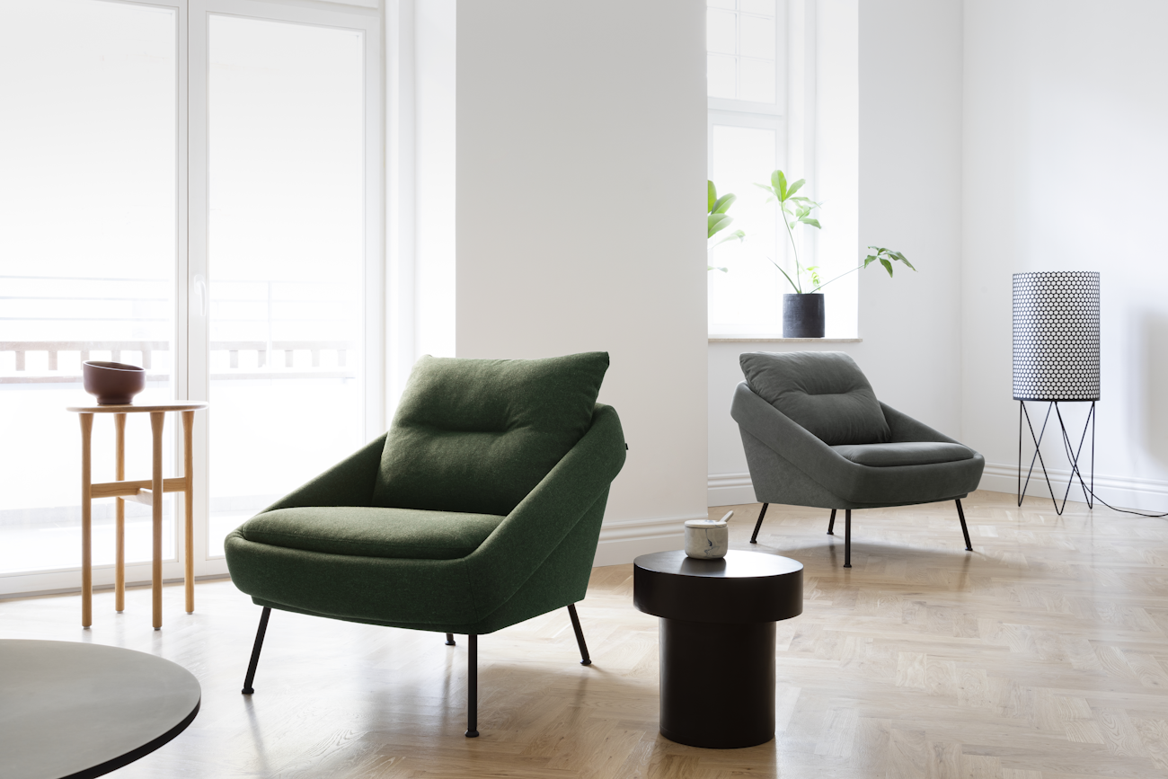
The Top Colours for Your Office to Increase Productivity
The debate surrounding whether colours can affect our mood, productivity and psychological wellbeing has been argued throughout history. One of the first studies to look into the links between colour and mood was in 1979 by Schauss. It was a study on American prisons that discovered at the time that by painting the walls pink, aggressive behaviours of inmates were reduced. While offices are not to be confused with prisons, this study does show how much of an impact colour can have.
Colour affects our daily lives more than we realise, and when it comes to the office environment, a strategic use of colours can help to boost employee’s productivity, health, and happiness.
There has been a significant amount of research surrounding the impact of colour. Research by the Department of Environmental Psychology at Lund University in Sweden showed that colour has a strong influence over our brain impulses and so can have a big impact on our behaviour and well-being.
The study measured heart and brain activity of people working in rooms with different colour schemes and the results showed that the brain was significantly more alert in colourful rooms (red and blue in particular) compared with neutral environments in one muted colour. The blue room was said to have a calming effect on the test subjects while the red room actually increased stress levels.
The impact the colour scheme an office has on its employees may surprise you. In this article, we will explain why it is time to ditch the solely white and grey offices and bring in some colour.
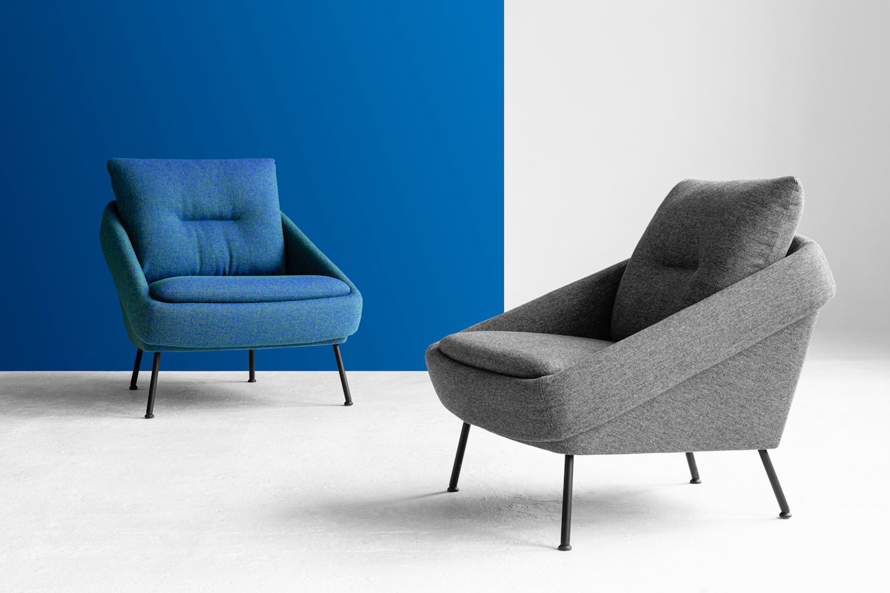
Blue: the best colour for efficiency in the office
Plenty of research has shown that blue is the favoured colour in the workplace as it is said to be the ultimate colour to promote wellbeing and efficiency. According to the research by Lund University, a room that is painted blue is especially beneficial for those who work in a fast-paced and demanding job. This is because blue is a harmonious colour that is stress relieving and does not disturb the focus of the brain, resulting in more efficient work being delivered.
However, it’s important to use the colour blue carefully in the office as some people find certain shades of blue a little depressing and sad. If a blue shade is too ‘cold’, it could make the office feel less inviting. This can leave employees feeling less comfortable and will instead hinder productivity.
To make sure the right shade of blue is chosen, our tip is to test how the colour looks in both natural and artificial lighting in your actual office space.
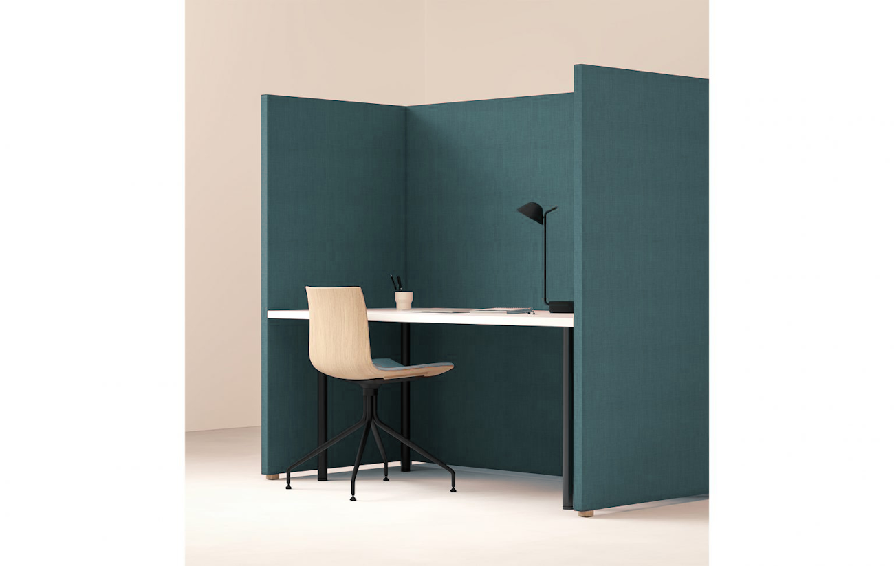
Our Zilenzio product Optima Floor can be seen in the picture below. A lightweight screen that is easy to install and move around, the Optima is environmentally friendly and creates a private nook in the office for employees to work quietly and maintain focus.
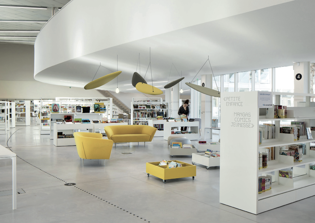
Yellow: the colour for creativity in the workplace
Environmental psychologist and wellbeing consultant, Lee Chambers, said that yellow is often considered the colour of creativity which is why it features often in innovation labs and other creative spaces. The colour yellow is viewed as an optimistic colour that can inspire increased levels of creativity and is great for areas of collaboration.
Yellow backgrounds increase information retention which is helpful for highlighting key learning and important information. According to Chambers, if you have a creative job, yellow is a solid choice as long as it is not overused as this could induce eye fatigue.
Green: for a calming and harmonious office environment
There will be little surprise that green is seen as calming and harmonious due to its association with nature and the outside world. Several studies have shown that having plants in the office will boost productivity, creativity, and overall happiness of workers due to their positive effect on the air whilst also being visually appealing.
Another positive of the colour green is that it causes less eye fatigue which helps with longer term focus and attention, making it a good choice for those who work longer hours or who suffer from screen-induced eye strain.
Similar to the colour blue, it has calming effects, but research shows that it produces less benefit for productivity but a higher increase in wellbeing and is a great choice of colour for a balance between the two. As you can see from the image above, the cream Focus Pod fits in perfectly with the green background.

Red: Stimulating and best for active workspaces
Red is known as an extremely stimulating colour that can indicate power and excitement. A splash of red in the office can be great to help boost stimulation in employees as long as it is used more sparingly as too much can cause anxiety and stress.
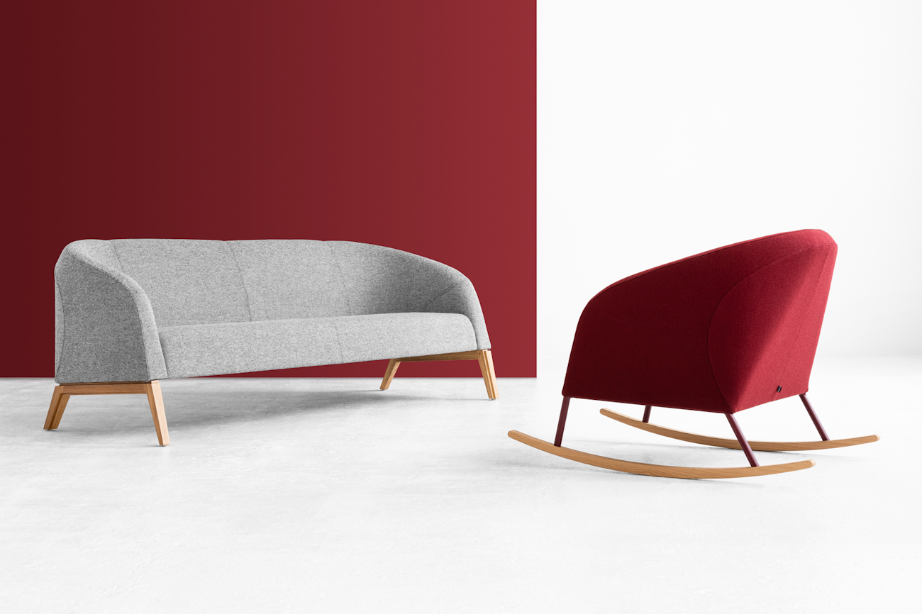
The colour red is best for active workspaces that require energised workers as it can attract attention and make us feel more active. According to Chambers, studies have found that the emotive and passionate fire of red raises blood flow and heart rate, which is why it’s best for physical workspaces such as gyms, think of it like a little energy bar.
Another study by University of British Columbia found that red boosts performance when employees have detail-oriented tasks such as proofreading or tasks that involve memory retrieval.
However, Red needs to be used wisely in order to take advantage of its benefits. Too much of it can easily become over stimulating so it’s best used in smaller splashes or combined with another colour such as blue to create a visually pleasing balance that can make employees more productive.
White: best for clean and clinical environments
54% of workers have their home office painted white and it isn’t considered to be the best colour for productivity, creativity or even happiness. Similar can be said for using the colour white in an office as it carries a reputation for being boring and uninspiring. It is best used for workspaces that need to provide a clean or clinical environment.
However, that doesn’t mean white should be written off for office environments as it can make a space feel bigger and cleaner making it great for smaller offices. White also coordinates well with pretty much all other colours so it can be easily combined with other colours in a room to make it more interesting. Our tip, if you do use white, use it in combination with colours.
Are you looking for some accessories and decoration to add colour to your office layout?
At Haiken, we have a variety of accessories and decoration that will help to bring more colour into your office space. Not only that, but some even have acoustic qualities so that you can cancel out noise disturbances too!
VIEW OUR ACCESSORIES & DECORATION SOLUTIONS
